
THE MUSEUM APP
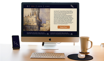
Turning a static, information-scarce museum experience into a real-time, personalized booking journey — from "confusing and impersonal" to "I'd absolutely use this."
CASE STUDY - BONUS
UX Research · Mobile App & Responsive Website · Booking & Payment System
TYPE
SCOPE
Booking System - Accessibility - Responsive Design
ROLE
UX/UI Designer — Solo project
INDUSTRY
Culture & Museums
FOCUS
Real-time Information - Booking Flow - Accessibility
DELIVERABLE
Hi-fi prototype (App + Responsive Website) - Design system


1. Empathize
The Museum App speaks to a wide spectrum of visitors — from regulars who return often to see every detail of an exhibition, to elderly visitors with more rigid schedules, teachers coordinating group visits, and international tourists trying to make the most of a short stay. What unites them is one need: fast, reliable, real-time access to what's actually happening at the museum.
Target audience:
A mobile app and companion responsive website for a museum, centralizing its schedule, exhibitions, accessibility accommodations, news, and an end-to-end booking-and-payment flow — designed to close the gap between "I want to visit" and "I'm walking through the door."
The product:

To keep every decision anchored to real behavior, I built 3 personas — Remi (74, retired pensioner and small-business owner), Ann (24, elementary teacher), and Jake (37, traveling orthopedic surgeon) — each with distinct goals, frustrations, and context, used throughout the process to pressure-test design decisions.
User research:


To understand the users better, I analyzed more into Remi's persona. Created a Journey Map, with a problem and goal statement of a specific user task for Remi.
Journey Map

To move beyond user personas, I developed a two-level journey map (macro and micro) to analyze the end-to-end experience of a critical task: checking the museum's weekend opening hours. This process uncovered key user needs, pain points, and decision-making moments, enabling the definition of a user-centered problem statement, clear product objectives, and measurable success metrics. The resulting solution was designed to help visitors with time constraints plan their visits more efficiently while encouraging increased attendance during off-peak hours.
Storyboard
Remi's Problem statement:
Remi is a retired pensioner and small business owner who needs to find out what time does the museum close on weekends because he wants to go as often as possible to the museum.
Goal statement:
The Museum App will let users see the opening and closing times of the Museum which will affect people with restricted schedules by letting them organize their visits to The Museum. We will measure effectiveness by comparing the number of visitors during off-peak hours before and after the launch of The Museum App


2. Define

Benchmark insights:
I opened with a competitive audit — direct competitors (world-renowned museum websites/apps) and indirect ones (third-party ticketing platforms) — benchmarked across 3 axes: information display, booking experience, and accessibility. This was complemented with secondary research on museum-visitor demographics and habits, gathered from articles and social listening, converging on 3 core user goals: see museum information in real time, schedule visits in advance, and track which exhibitions they've already seen.


The goal:
Let users see museum information in real time, enabling both new and frequent visitors to schedule and customize their visits while keeping a record of exhibitions already seen — converting one-off visitors into a returning, engaged audience.
The problem:
Potential visitors lack easy access to real-time information about the museum. As a result, they find the experience confusing and impersonal, leading many to choose not to visit.

Mobile Version
3. Ideate
User Flow:
-
Open app
-
View Homepage
-
Select “Book Now” button
-
View Booking page
-
Select date and time of visit
-
Is this date and time correct? Select yes or no
-
Do you have any accommodation in order? Select yes or no
-
View the checkout screen with preview of the date, time and reminder or location
-
Insert checkout information
-
Click checkout
User Task: Use The Museum App to book tickets for next week

User Task: Use The Museum App to find out what time does the museum close on weekends
-
Open app
-
View Homepage
-
Scroll down to the Opening hours section
-
Select “Watch the schedules for the week”
-
View Calendar page

User Task: Use The Museum App to know the accommodations for a hearing impaired person
-
Open app
-
View Homepage
-
Select "Accessibility" head title
-
View Accessibilitypage
-
Select the scroll down menu for hearing and audio

Low-Fidelity Wireframes:


4. Prototype
High-Fidelity Wireframes:
The high-fidelity designs were developed in Figma, refining visual direction, typography, and layout to align with the brand's elegant, art-deco-inspired identity.


Mockup
I built an interactive prototype in Figma to simulate the user experience, test the flow, and visualize key interactions.
Close up
Every screen was built on deliberate heuristic decisions, not guesswork. The result: an interface that feels intuitive on the first tap, not after a learning curve.
_edited.png)
Usability study
To validate those decisions against real behavior, I ran an unmoderated usability study, asking participants to complete core flows — booking a reservation, finding contact/help information, and locating accessibility details — inside the high-fidelity Figma prototype, then debriefed via voice-recorded interviews.

“it’s a really smooth experience and I’d definitely use this app to book a visit in real life. (...) benefit from being a little more engaging, visually”

“I could see myself use the app regularly because i can see it has a lot of potential”
The response was clear: testers called it "a really smooth experience" they'd "definitely use... to book a visit in real life," and one described it as having "a lot of potential" for regular use. The most consistent piece of constructive feedback — that the flow, while clear, felt visually a bit cold — became the direct input for the next design iteration, closing the loop between testing and refinement.
Accessibility
considerations
I designed a dedicated, easy-to-find Accessibility tab, plus the option to add specific accommodations directly during the booking process, so users don't have to search for support after the fact. High-contrast text, buttons, and widgets ensure legibility across visual abilities, built on a disciplined 60-30-10 color system. Onboarding and navigation lean on Jakob's Law and the Law of Proximity, keeping first interactions familiar regardless of a user's prior digital literacy — a direct response to insights from the Remi persona.

Responsive Website
3. Ideate
Sitemap:

Low-Fidelity Wireframes:


4. Prototype
High-Fidelity Wireframes:
The high-fidelity designs were developed in Figma, refining visual direction, typography, and layout to align with the brand's elegant, art-deco-inspired identity.
Mockup
I built an interactive prototype in Figma to simulate the user experience, test the flow, and visualize key interactions.
Close up
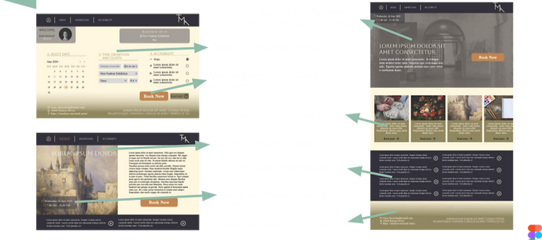
Adapting the experience to a wider canvas meant rethinking scanning behavior, not just resizing components. Every summary block was written to highlight the most decision-relevant information first — date, time, cost — so users can act without hunting for it.
_edited.png)
Usability study
The web version went through the same rigor as its mobile counterpart: an unmoderated usability study with tasks built around booking, accessibility lookup, and general navigation, followed by recorded debriefs. Feedback confirmed strong cross-platform consistency
“it’s elegant and simple, but maybe some color contrast or light visual accents would add warmth”
“I like how (again) it's very lineal the process (...) and you can see a summarize about the hole thing”
Users who had already tested the app described a seamless mental migration between the two, evidence that the design system was translating correctly across devices rather than feeling like two different products. As with mobile, testers appreciated the clarity but asked for slightly more visual warmth — validating the color and contrast direction as a shared next step for both platforms.
Accessibility
considerations
Accessibility carried over as a non-negotiable, not a platform-specific afterthought. The same dedicated Accessibility section and in-booking accommodation options were rebuilt for desktop, maintaining high-contrast components and the 60-30-10 color rule across the larger viewport. Applying Jakob's Law and the Law of Proximity at web scale meant keeping navigation patterns familiar to what users already know from mainstream sites — critical for reaching the Next Billion Users population this responsive version was designed to serve, where confidence with unfamiliar interfaces can't be assumed.
_edited.png)
5. Going forward

Add richer visual cues — bolder section headers, soft illustrations, and confirmation micro-animations — to counter the "clear but sterile" testing feedback and bring more warmth to the booking and payment flow.
Multilingual support via dynamic translation, extending accessibility to non-native visitors.
Personalized visitor recommendations, using behavior and preferences to surface tailored exhibitions.
AR integration for immersive in-person guides, 3D models, and storytelling.
Social sharing features to increase organic engagement and museum visibility.

